I love design, and my fiancé happens to work in marketing, so between the two of us, I knew creating a cohesive “wedding brand” would be one of the most natural—and fun—parts of the planning process. From the very beginning, we wanted everything to feel intentional and thoughtfully connected, rather than like a collection of random wedding details. We kept coming back to the idea of something classic yet fun—think J.Crew meets Kate Spade—with a look that felt timeless but still had plenty of personality.
We landed on navy as our main color, which instantly gave the overall design a polished, classic foundation. From there, we were able to layer in pinks and teals to add warmth, playfulness, and a bit of unexpected charm without losing that refined feel. It was the perfect balance for us and set the tone for everything from stationery to décor.
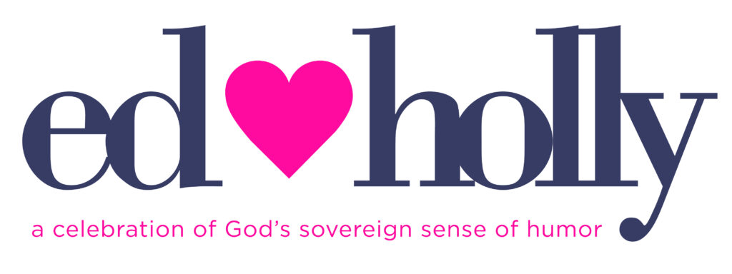
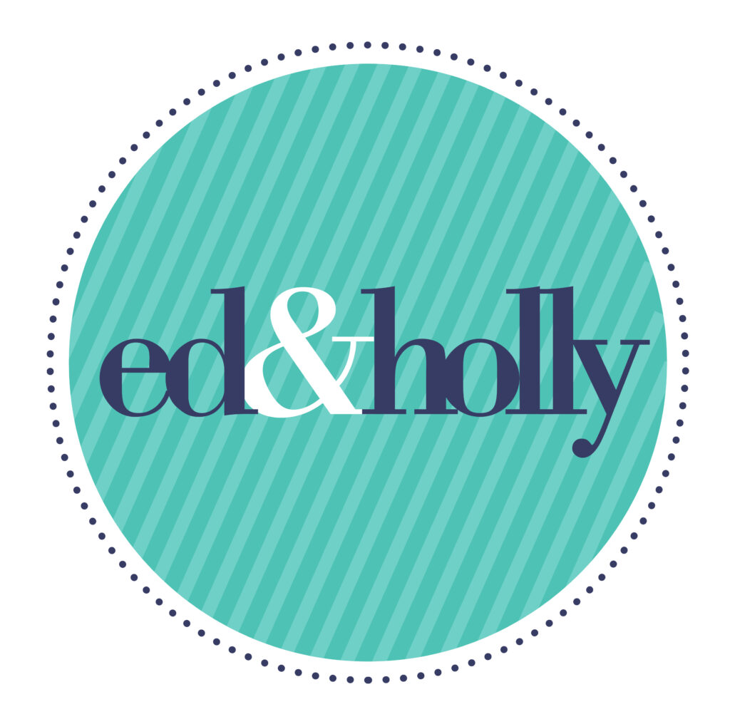
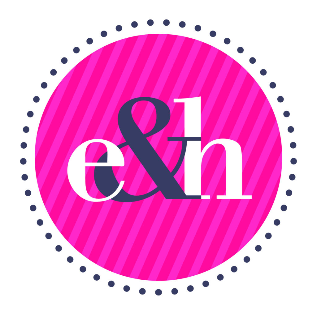
Elizabeth Benjamin did a fabulous job bringing this vision to life by creating three different logos that we’ll be using throughout the wedding. Each one feels cohesive but distinct, which makes them incredibly versatile. I especially love the subtle use of pinstripes and polka dots in the second and third logos—they add visual interest and texture in a way that feels elegant rather than overwhelming.
Logo
This version was designed with a teal accent, which gives it a slightly less feminine feel—although I’ll admit this one is still my personal favorite. After a long brainstorming session, we finally landed on our wedding tagline, and it felt like the perfect fit for both our relationship and the overall mood of the wedding.
We have a very long love story that neither of us saw coming, and this tagline allowed us to celebrate the ways God worked in both of our lives and ultimately brought us back together. It feels meaningful, hopeful, and true to who we are as a couple.
Embellished Logo
We’re using this version to help carry the theme and colors consistently throughout the wedding details. I love how the subtle pinstripes and polka dots are incorporated—they create an elegant yet fun visual that ties everything together beautifully. It’s playful without being too whimsical and polished without feeling stiff, which is exactly what we were aiming for.

